BuildingExplorer
require(["esri/widgets/BuildingExplorer"], function(BuildingExplorer) { /* code goes here */ });esri/widgets/BuildingExplorerThe BuildingExplorer widget is used to filter and explore the various components of BuildingSceneLayers. BuildingSceneLayers are complex digital models of buildings and interiors and can contain thousands of components grouped in sublayers. Using this widget, buildings can be filtered by level, construction phase or by disciplines and categories. Three elements are used to filter BuildingSceneLayers: the Level element, the Construction phases element and the Disciplines are Categories list. The visibility of these elements can be configured using the widget's visibleElements.
The BuildingSceneLayers to be explored have to be set on the layers property of the widget. When setting multiple layers, the filters set by the widget will be applied on all layers. The widget doesn't allow the user to select between multiple BuildingSceneLayers in a SceneView.
Often, BuildingSceneLayers contain an overview BuildingComponentSublayer that serves as an exterior shell and views the building model as a single feature. When a layer is added to the BuildingExplorer widget, the visibility of the overview layer is turned off, so that the user can interact with the individual features in the full model BuildingGroupSublayer.
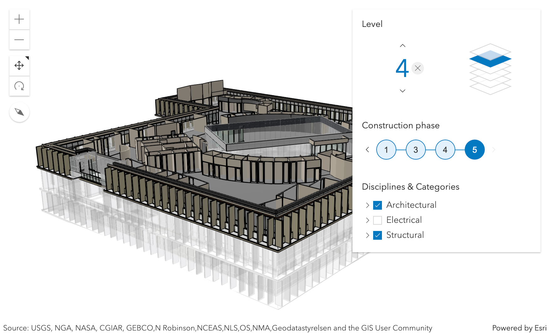
The Level element of the BuildingExplorer widget allows to select a single level in one or several buildings. When selecting a level, the levels above it are hidden and the levels below it become semi-transparent for added visual context.
Some BuildingSceneLayers include information indicating the phase when the components were created, and optionally, when they were demolished. If a layer has multiple construction phases, these will be displayed in the Construction phases element. When selecting a construction phase, all the components created during or before the phase are selected. Demolished components aren't displayed.
Discipline layers are group layers that organize the BuildingSceneLayer content into architectural, structural, mechanical, or electrical groups. These layers contain a number of Category layers such as walls, windows, furniture, and lighting fixtures. These layers can be turned on and off in the Disciplines and Categories list.
The widget can only display filters set by the widget itself. Filters set by other applications will be ignored.
- See also:
const buildingExplorer = new BuildingExplorer({
  view: view,
  layers: [buildingSceneLayer]
});
// adds the BuildingExplorer to the top right corner of the SceneView
view.ui.add(buildingExplorer, "top-right");
Constructors
- new BuildingExplorer(properties)
- Parameter:properties Objectoptional
See the properties for a list of all the properties that may be passed into the constructor.
Property Overview
| Name | Type | Summary | Class | |
|---|---|---|---|---|
| String|HTMLElement | The ID or node representing the DOM element containing the widget. more details | more details | Widget | |
| String | The name of the class. more details | more details | Accessor | |
| String | The widget's default CSS icon class. more details | more details | BuildingExplorer | |
| String | The unique ID assigned to the widget when the widget is created. more details | more details | Widget | |
| String | The widget's default label. more details | more details | BuildingExplorer | |
| Collection<BuildingSceneLayer> | A collection of layers of type BuildingSceneLayer that are added to the widget for exploration. more details | more details | BuildingExplorer | |
| SceneView | A reference to the SceneView. more details | more details | BuildingExplorer | |
| BuildingExplorerViewModel | The view model for this widget. more details | more details | BuildingExplorer | |
| VisibleElements | This property provides the ability to display or hide the individual elements of the widget. more details | more details | BuildingExplorer |
Property Details
The ID or node representing the DOM element containing the widget. This property can only be set once. The following examples are all valid use cases when working with widgets.
Examples:// Create the HTML div element programmatically at runtime and set to the widget's container const basemapGallery = new BasemapGallery({ view: view, container: document.createElement("div") }); // Add the widget to the top-right corner of the view view.ui.add(basemapGallery, { position: "top-right" });// Specify an already-defined HTML div element in the widget's container const basemapGallery = new BasemapGallery({ view: view, container: basemapGalleryDiv }); // Add the widget to the top-right corner of the view view.ui.add(basemapGallery, { position: "top-right" }); // HTML markup <body> <div id="viewDiv"></div> <div id="basemapGalleryDiv"></div> </body>// Specify the widget while adding to the view's UI const basemapGallery = new BasemapGallery({ view: view }); // Add the widget to the top-right corner of the view view.ui.add(basemapGallery, { position: "top-right" });
The name of the class. The declared class name is formatted as
esri.folder.className.
- iconClass String
The widget's default CSS icon class.
The unique ID assigned to the widget when the widget is created. If not set by the developer, it will default to the container ID, or if that is not present then it will be automatically generated.
- label String
The widget's default label.
- layers Collection<BuildingSceneLayer>
A collection of layers of type BuildingSceneLayer that are added to the widget for exploration. The widget is only displayed when this property is set. In case of multiple layers, the widget will display and apply the filters on all layers.
- viewModel BuildingExplorerViewModelautocast
The view model for this widget. This is a class that contains all the logic (properties and methods) that controls this widget's behavior. See the BuildingExplorerViewModel class to access all properties and methods on the widget.
- visibleElements VisibleElementsautocast
This property provides the ability to display or hide the individual elements of the widget. BuildingExplorer has three elements: buildings levels filter, construction phases filter and the sublayers list. By default they are all displayed. In case the BuildingSceneLayer doesn't provide field statistics information, then the filters for building levels and construction phases will not be displayed.
Example:// only display the building levels filter buildingExplorer.visibleElements = { phases: false, disciplines: false };
Method Overview
| Name | Return Type | Summary | Class | |
|---|---|---|---|---|
| String | A utility method used for building the value for a widget's | more details | Widget | |
Destroys the widget instance. more details | more details | Widget | ||
| Boolean | Emits an event on the instance. more details | more details | Widget | |
| Boolean | Indicates whether there is an event listener on the instance that matches the provided event name. more details | more details | Widget | |
| Object | Registers an event handler on the instance. more details | more details | Widget | |
Widget teardown helper. more details | more details | Widget | ||
This method is primarily used by developers when implementing custom widgets. more details | more details | Widget | ||
| Object | This method is primarily used by developers when implementing custom widgets. more details | more details | Widget | |
Renders widget to the DOM immediately. more details | more details | Widget | ||
This method is primarily used by developers when implementing custom widgets. more details | more details | Widget |
Method Details
A utility method used for building the value for a widget's
classproperty. This aids in simplifying CSS class setup.Parameter:repeatable The class names.
Returns:Type Description String The computed class name. Example:// .tsx syntax showing how to set CSS classes while rendering the widget render() { const dynamicIconClasses = { [CSS.myIcon]: this.showIcon, [CSS.greyIcon]: !this.showIcon }; return ( <div class={classes(CSS.root, CSS.mixin, dynamicIconClasses)} /> ); }
- destroy()inherited
Destroys the widget instance.
Emits an event on the instance. This method should only be used when creating subclasses of this class.
Parameters:type StringThe name of the event.
event ObjectoptionalThe event payload.
Returns:Type Description Boolean trueif a listener was notified
Indicates whether there is an event listener on the instance that matches the provided event name.
Parameter:type StringThe name of the event.
Returns:Type Description Boolean Returns true if the class supports the input event.
Registers an event handler on the instance. Call this method to hook an event with a listener.
Parameters:A event type, or an array of event types, to listen for.
listener FunctionThe function to call when the event is fired.
Returns:Type Description Object Returns an event handler with a remove()method that can be called to stop listening for the event(s).Property Type Description remove Function When called, removes the listener from the event. Example:view.on("click", function(event){ // event is the event handle returned after the event fires. console.log(event.mapPoint); });
- own(handles)inherited
Widget teardown helper. Any handles added to it will be automatically removed when the widget is destroyed.
Parameter:handles WatchHandle|WatchHandle[]Handles marked for removal once the widget is destroyed.
- postInitialize()inherited
This method is primarily used by developers when implementing custom widgets. Executes after widget is ready for rendering.
This method is primarily used by developers when implementing custom widgets. It must be implemented by subclasses for rendering.
Returns:Type Description Object The rendered virtual node.
- renderNow()inherited
Renders widget to the DOM immediately.
- scheduleRender()inherited
This method is primarily used by developers when implementing custom widgets. Schedules widget rendering. This method is useful for changes affecting the UI.
Type Definitions
- VisibleElements
The visible elements that are displayed within the widget. This provides the ability to turn individual elements of the widget's display on/off.
- Properties:
- optionallevels BooleanDefault Value:true
When set to
false, the building levels filter is not displayed.optionalphases BooleanDefault Value:trueWhen set to
false, the construction phases filter is not displayed.optionaldisciplines BooleanDefault Value:trueWhen set to
false, the disciplines and categories sublayer list is not displayed.